Too many apps to declutter?
No Problem!
Timeline
2 months
My role
UX UI designer
User Research
Prototyping
Usability Testing
Tools used
Figma
Miro
Wipaap is an app where user can manage subscriptions from monitoring periodically to unsubscribe, pause or cancel.
Mission
As the company plans on expansion, creating mobile-friendly version of its product gain more potential users within broader audience.
Wipaap wants to research these questions to improve
Let’s say you are seeing the entirety of subscription at once. What are the categories that you want to see?
How comfortable are you to share your private information? For example, would you be comfortable sharing your banking info when subscription autodetection occurs?
What are the decision making factors to continue/cancel the app?
What other features do you like to see besides subscriptions?
Design Constraints
With subscription business models as popular as they are, it’s become increasingly harder for consumers to keep track of their subscriptions. Consumers may get charged for services they aren’t using or trials that have expired. Wipaap has a desktop-only website that helps users track their subscriptions. This (fictitious) company would like to capture a larger audience by developing a mobile app.
Solutions
Wipaap has provided the upcoming subscriptions in a glance ordered by due days and show trial subscription. When the user want The app also has the overview section where it displays much detail information.
Wipaap will find the answers for
Lay out the most viewed/interested categories in order.
Find how comfortable the users feel when sharing their banking/private information.
Listen to the users who had experiences in continue/cancel the app and build their user mapping.
Research current apps to observe which could be other possible categories that users would utilize.
My UX Process
Initial research
Insights and Thoughts
Manual inputting system in Trackmysub would be ideal for the users who doesn’t like sharing their info.
Alert system: texting/email/app alert with frequency.
Suggest tier of plan for the users to access the plan modification.
Expiring apps should be displayed on the dashboard page.
I learned that when user want to cancel the plan, there can be at least an instruction showing how it could be done.
offline option seems promising.
Look, Mock and analyze format can help quickly visualize the existing examples to help building the new app from scratch taking reference for inspirational ideas and starting point to create my designs.
As I thoughtfully process the design constraints, I have evaluated some questions to the current app for observing the value where the user will appreciate/depreciate.
1. Methodology
Primary research
I made screening surveys to ask if users have used any app to help them reaching their financial goals. Out of 31, I recruited 5 interviewees to conduct user interviews in moderated remote/in-person environment.
3. Participant
Preferrably over 30 years of age
They use phone and desktop equally
Middle class
Trying to be more budget-conscious
2. Questions
How are the users managing app/other subscriptions?
How the user knows when to cancel, pause or renewal?
What are their like/dislike features?
What are their inspiration/motives behind as they organize their app plans?
Company Goal- This project will help users to cut back on unneccessary monthly fees to avoid unwanted/unexpected charges appear on the bank account log. There are many financial managing apps but it is the best when the app can really be useful by saving the user’s time and money and that is the aim that validates this project’s value.
Sample questions in Screening survey
Interview log
Synthesizing results
The user interview data is gathered and organized by affinity mapping process demonstrating the like minded ideas categorized by the same color stickies. After collecting the same colored stickies all together, the groups form eventually and the similarities and insights reveal the project’s aim with clearer goals which defines priorities.
1. Gather 💡
2. Group 🧳
Persona
Based on the user interviews, I identified 2 types of users and created an empathy map for each one by their sensitivity level of sharing important account information.
Using the empathy maps, I developed a persona to capture the different motivations, goals, and frustrations for their experiences with app subscriptions and researching.
Design: Userflow
This userflow scenarios are created based on the most demanded information that users want to experience when using the Wipaap.
The Most Viable Product (MVP) routes are cancellation, add subscription and overview of user’s subscribed expenses.
Quick hand sketch
Here is my quick sketch before jumping into design from computer.
The main idea from onboarding centralize on the user’s preference tailored to their personalized goals in addition so that the app can be more effectively helping the users.
On top information in dashboard demonstrates the chart where the user can oversee the amount of subscribed apps as to set their personalized limit on their expense entirely from the app.
Based on the previous steps, The low fidelity design of MVP was born under the rough sketches that brainstormed earlier.
The research synthesis brought more contents and ideas about the overall flows based on How-Might-We questionnaire which are respectively presented as the detailed wireflow.
Brand attributes
Wireframes
High Fidelity: First round
After reviewing the feedbacks from the interview, I gained much insights from different perspectives of individuals especially the dashboard. So I considered about re-organizing the information and retouched designs as to improve the efficiency of the red routes and values to be prioritized.
Below images are the first and most important screens.
Test: LoFi
I Interviewed 10 people in total (5 interviewee had virtual sessions and other 5 had in-person interviews) that fit into the app's targeted users.
Each interview lasted about 30 minutes.
TASKS
1. Cancel Netflix subscription.
2. Add subscription manually.
3. View all of my subscriptions.
4. View my expense view.
After testing, wireframes needed much improvement beginning from the user flow lay-out to the very detailed wording choices.
As a result, the first high fidelity screens will contain much purpose and deliverables.
Test: HiFi
Several users had raised their preference on having a toggle where user can switch the background as light/dark mode.
Issue#1
Resolved
The user can see the overview page with the dark background with neon colored chart.
Some users have demanded that when they change plan, they need some security confirmation to prevent any mistakes.
Issue#2
Resolved
Integrate the face recognition system by adding am extra step before entering sensitive information. Also the hamburger button will lead user to detail from pop-up style guide.
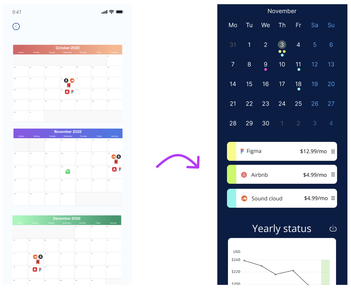
The calendar view looks too small and hard to find what it means.
Issue#3
Resolved
The colored dots indicate the subscription categories instead of cramming in the calendar.
Iterate &Iterate
The last but not least, testing the final design always has the room to improve.
I have finalized the app to improve on design and efficacy. Feel free to leave any comments for Wipaap!
The idea of having the subscription app over managing the subscriptions might sound exclusive to some users who only have manageable quantity of apps. So it is possible that not all users are able to relate themselves to find this app useful. However, the usage of app can not only organize the monthly spending but save in long run by seeing the overview of the app in one place and inspire users analyzing the value of subscribing. To speak the value in function, the user will appreciate in a long run according to my research data.
I was intrigued of how the auto layout has helped me to progress my deliverable faster and effective. It saved a lot of time and it was easy to correct the minor UI issues.
I found many people are not so comfortable sharing their sensitive data nor have used such app that helps to declutter. I wished that there are more wide spectrum of audience who are familiar with such app and find other ways to implement their data without expose from having the third party app involved.
Thank you!


